

SSC CUPS
The Student Services Center (SSC) was set to open in Spring 2019 at Santa Monica College (SMC) main campus with the goal of consolidating all the major student services under one roof. We decided to advertise the building's grand opening and its resources on coffee cups.
Client
Santa Monica College
Santa Monica College
Timeline
February 2019 — April 2019 (8 weeks)
February 2019 — April 2019 (8 weeks)
Collaborators
Rachael Legge, Jeffrey Reyes, Xeniya Ruchka
Rachael Legge, Jeffrey Reyes, Xeniya Ruchka
My role
Field Research, Visual Design, Prototyping
Field Research, Visual Design, Prototyping
We designed a coffee cup sleeve that advertises the Student Services Center and promotes its resources, with incentivization and environmental sustainability in mind.
The big idea is that SSC cup sleeves would be placed at the cafes inside the campus. Students would be given a cup sleeve each time they get a beverage from the cafe. Students who would then take the cup sleeve to the grand opening of the SSC could redeem a free reusable cup or other merchandise.
Problem
Students knew little about the Student Services Center and what it has to offer the SMC community. We were tasked to deliver a research-based creative solution to promote the building and its services.
Insight
The SSC was proposed prior to its official opening. In 2010, the unfinished building won the Los Angeles chapter of the American Institute of Architects, thanks to the focus on energy-efficiency and modern aesthetic.
We also had the opportunity to speak with the deans in charge of the Community and Academic Relations (Kiersten Elliot and Erica LeBlanc). They envisioned SSC to be a community building that welcomes new and potential students, provides a sense of belonging to current students, and serves as a guided pathway for any student who might feel lost in the process.
Design Process
- Stakeholder interviews
- Field research
- User testing & interviews
- Rapid prototyping
- Pitch
- Field research
- User testing & interviews
- Rapid prototyping
- Pitch
We tested our initial designs by interviewing several students at the main campus:
SUSTAINABLE FACTOR
A lot of the students we interviewed were interested in knowing how sustainable the new building was going to be. Also, a student-worker from SMC Recycling mentioned that the cup sleeve was the only recyclable part of the cup, which led us to this idea of advertisement on the cup sleeve, rather than designing the cup itself.
A lot of the students we interviewed were interested in knowing how sustainable the new building was going to be. Also, a student-worker from SMC Recycling mentioned that the cup sleeve was the only recyclable part of the cup, which led us to this idea of advertisement on the cup sleeve, rather than designing the cup itself.
CHANGES IN CONCEPT NAME
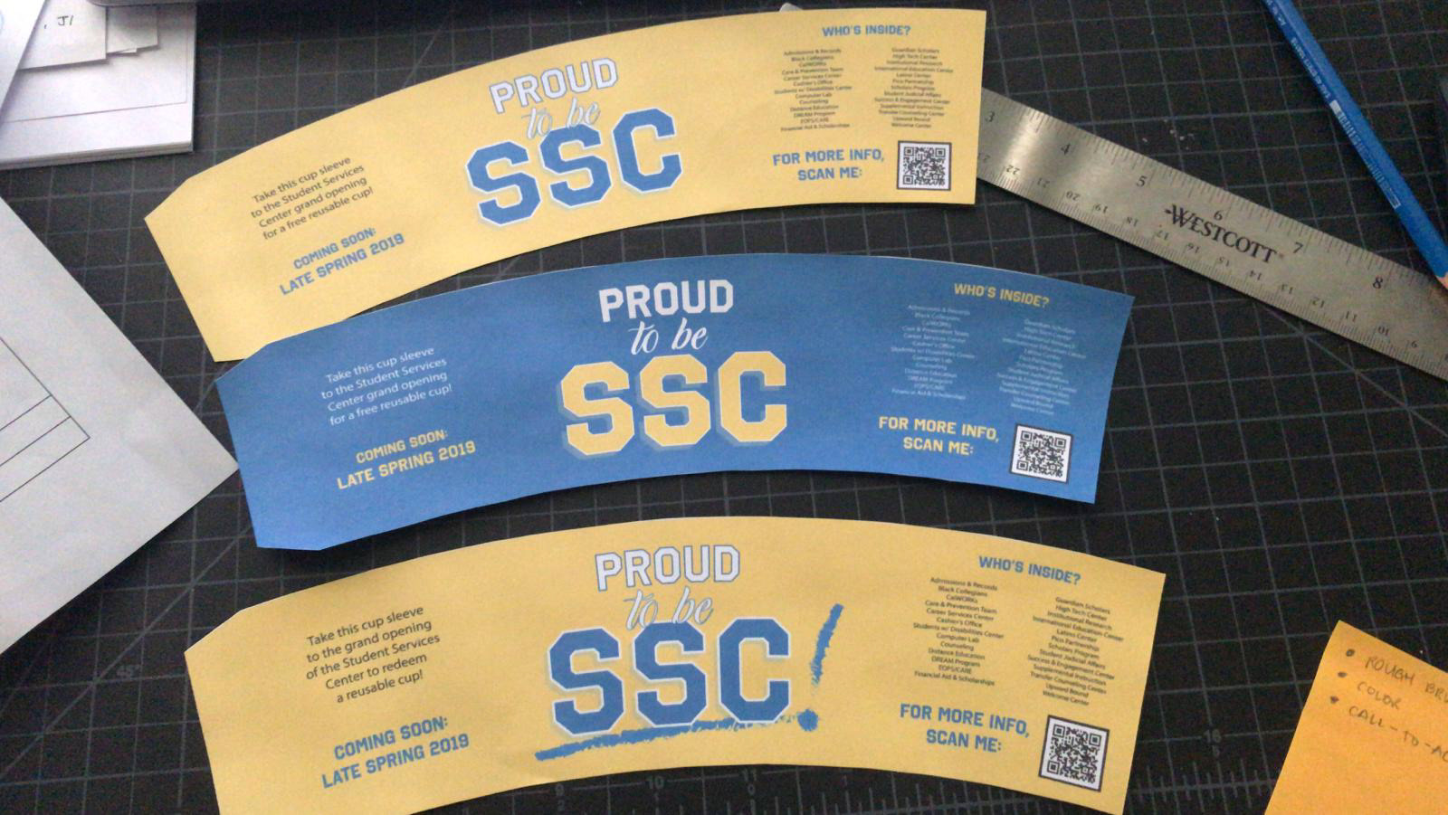
A participant brought up that our initial concept name “Proud to be SSC” was not working because “Proud to be Student Services Center” did not make sense to him. He also mentioned that in our initial designs, we highlighted the acronym SSC in big text, but we did not state what it meant, which might confuse students who don’t know anything about the building.
A participant brought up that our initial concept name “Proud to be SSC” was not working because “Proud to be Student Services Center” did not make sense to him. He also mentioned that in our initial designs, we highlighted the acronym SSC in big text, but we did not state what it meant, which might confuse students who don’t know anything about the building.
INADEQUATE ADVERTISEMENTS
We asked our participants about the SSC promotional banners around campus but their responses suggest as if they were never there. In fact, a lot of students did not know about the new building until the interview – which led us to conclude that the current advertisements about the new building are inadequate.
We asked our participants about the SSC promotional banners around campus but their responses suggest as if they were never there. In fact, a lot of students did not know about the new building until the interview – which led us to conclude that the current advertisements about the new building are inadequate.
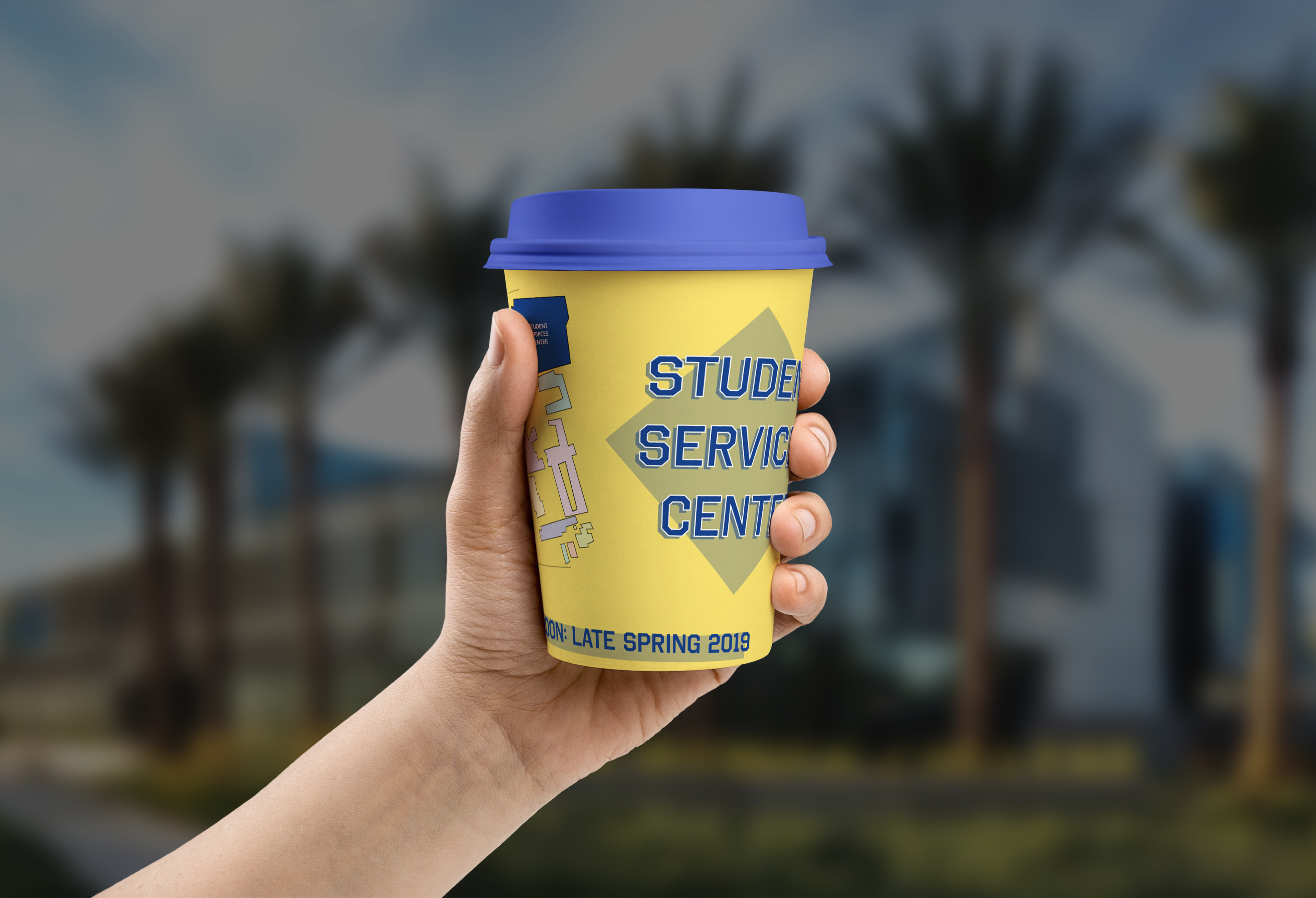
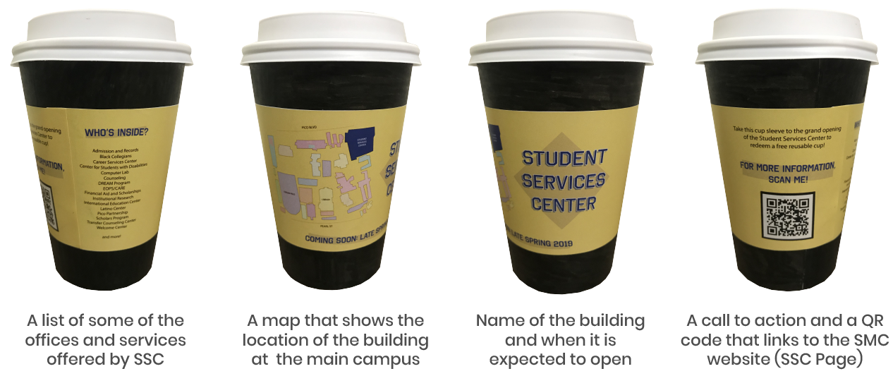
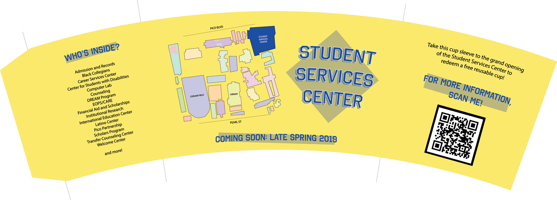
For our final design, we went with the blue text on yellow background since it stood out more to our interview participants. Not only that it is more readable, it also conforms to existing official school colors. In addition, we added a map of the SMC main campus that highlights the location of the SSC. We also stated a list of some of the services, to inform students of the what SSC offers.
After presenting to the class and the stakeholders, here are some of the feedback that we gathered:
LIST OF SERVICES
The list of services we choose to include in the design may bump into political issues; although only certain services students utilize the most, it is still ideal to list each and every service due to political reasons, rather than leave out some of them.
The list of services we choose to include in the design may bump into political issues; although only certain services students utilize the most, it is still ideal to list each and every service due to political reasons, rather than leave out some of them.
INCENTIVIZING THE STUDENTS
Offering a redeemable free item can be an effective way to catch the students’ interest and even entice them to come to the grand opening of the SSC and learn more about it.
Offering a redeemable free item can be an effective way to catch the students’ interest and even entice them to come to the grand opening of the SSC and learn more about it.
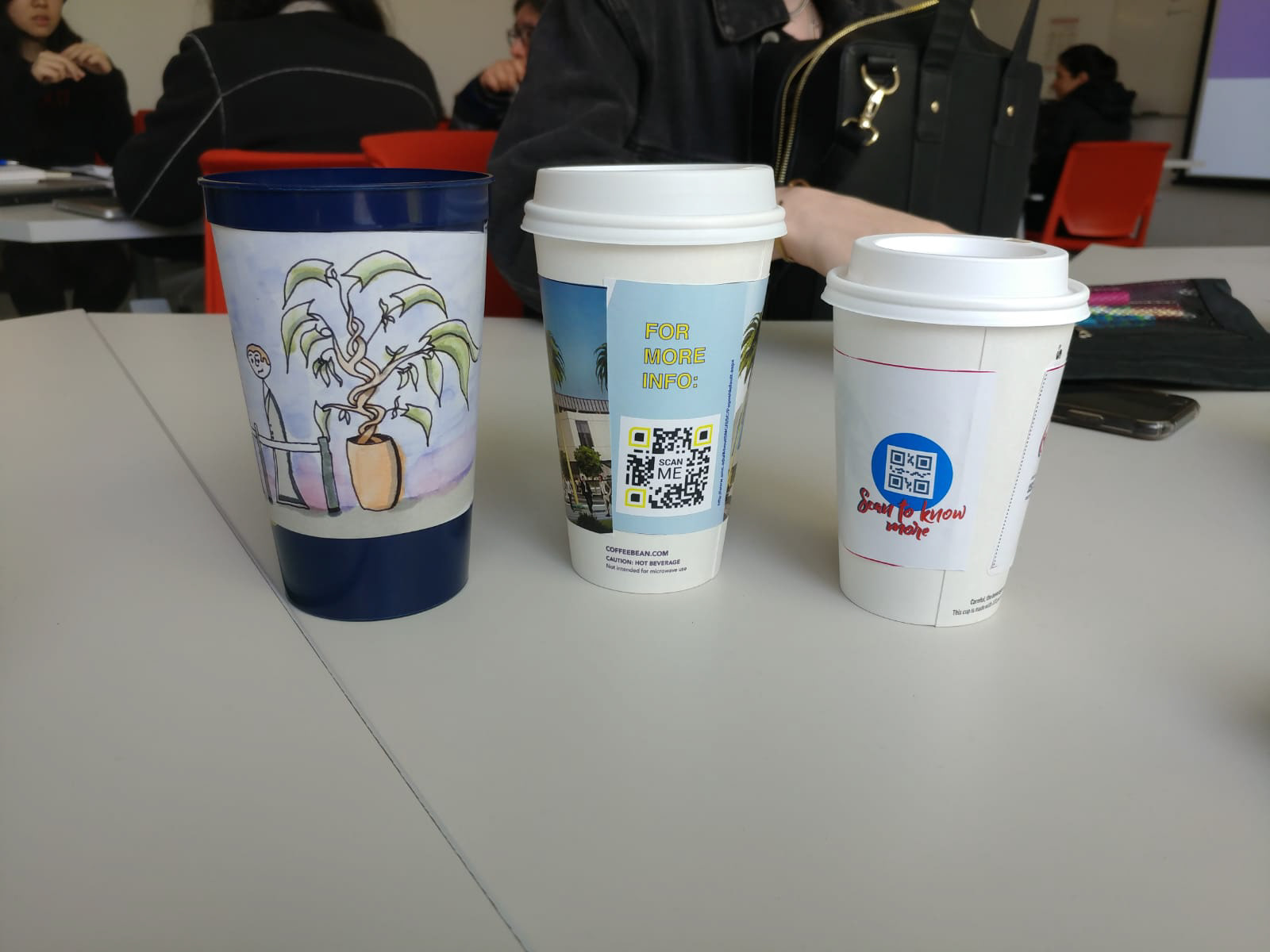
QR CODE
Certain demographic may not be aware of what a QR code is or how it works; putting the entire URL is something to consider.
Certain demographic may not be aware of what a QR code is or how it works; putting the entire URL is something to consider.
VOUCHER SYSTEM
Voucher system may be a little too much work; Offering an redeemable item may work better.
Voucher system may be a little too much work; Offering an redeemable item may work better.
Final iteration
Reflection
Our team had to rethink our concept midway through the process, but it greatly helped us move forward in coming up of a better solution. Considering this is one of my first UX projects, I am proud of how much I learned, not only in research skills and design thinking aspect, but also figuring out ways to work with the differences between team members.
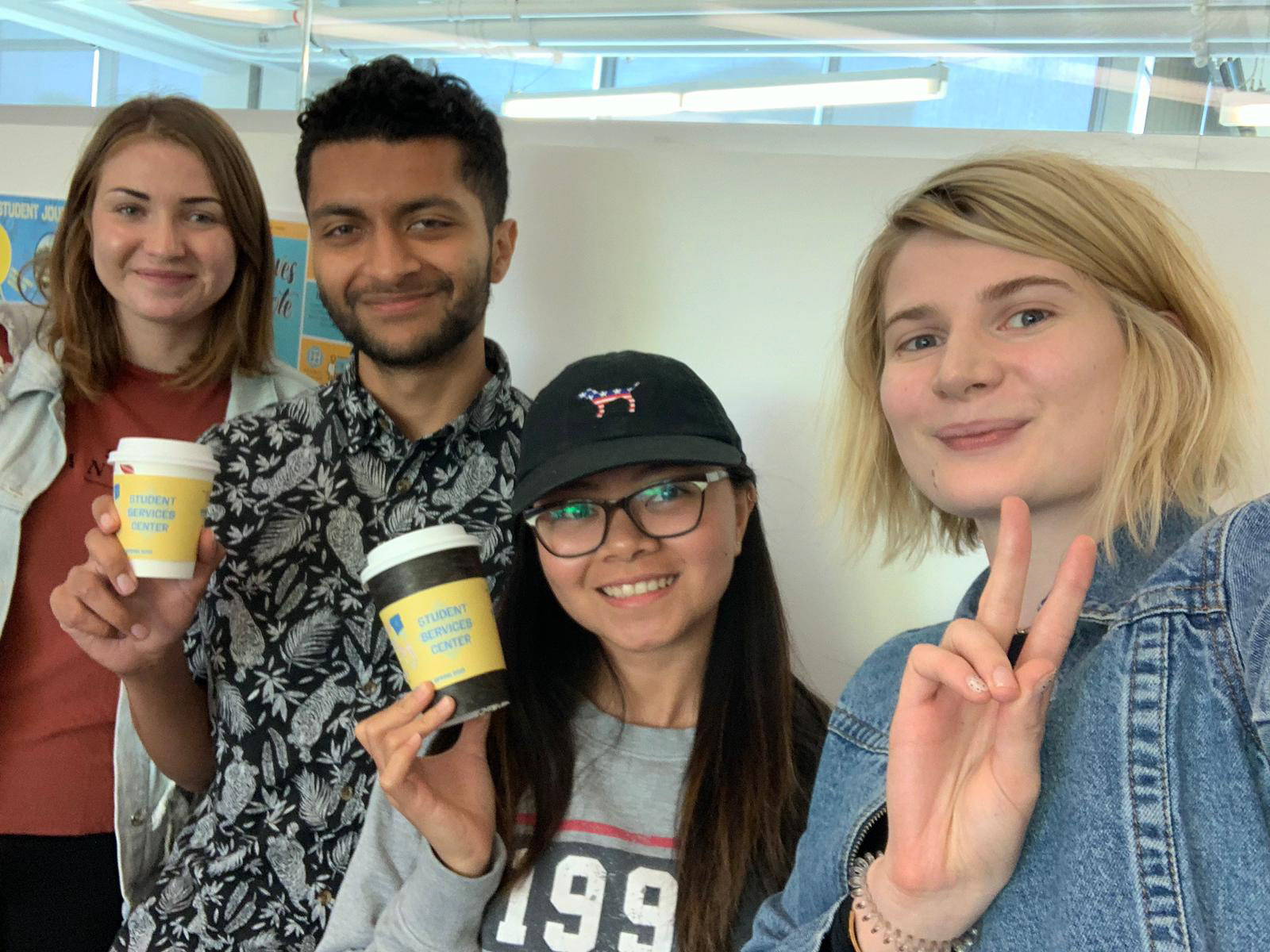
Our team: Xeniya, Jeff, Jiashi, Rachael