CICLAVIA GUIDED POSTERS
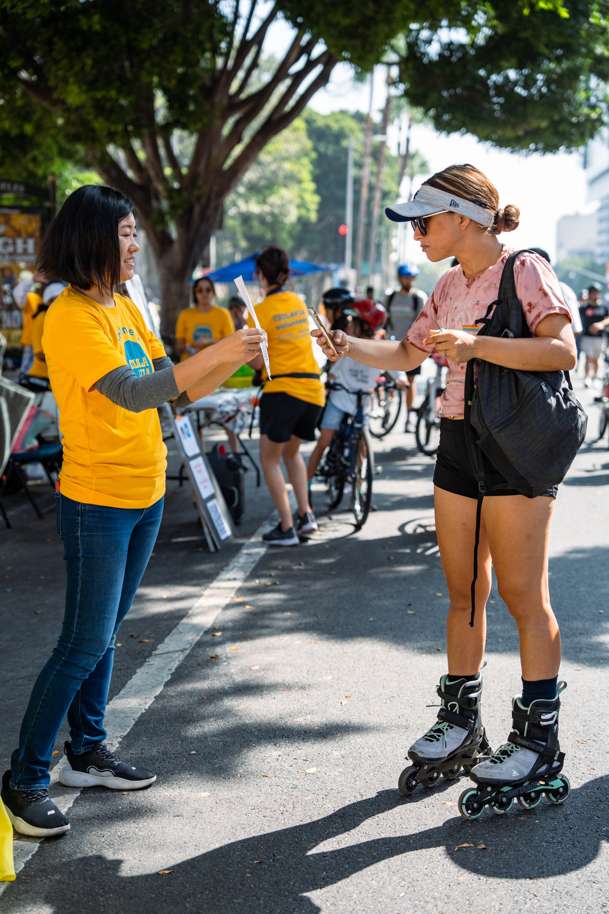
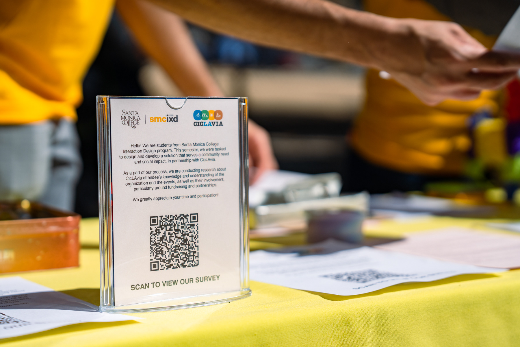
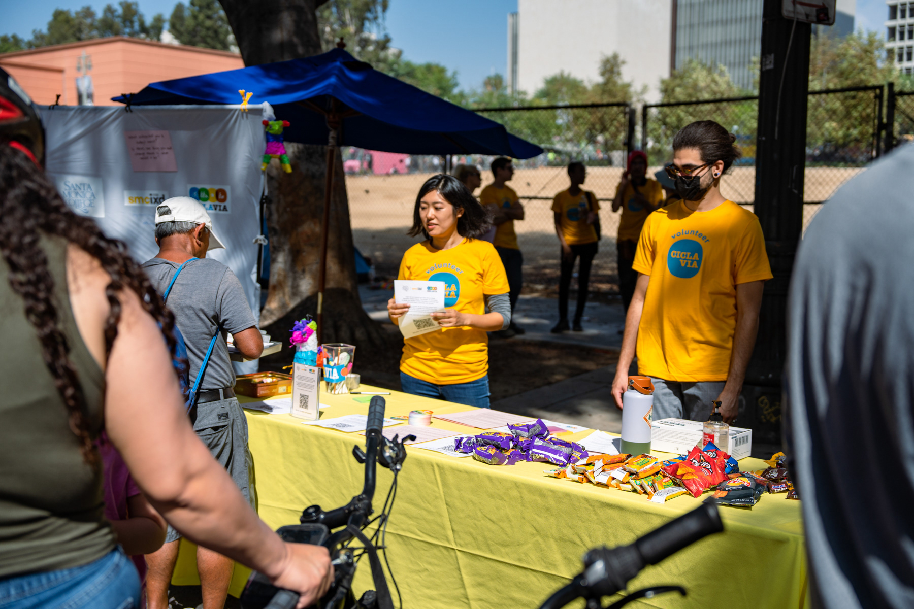
On December 4th, we conducted an interactive and guided poster campaign at the CicLAvia South Los Angeles event to increase awareness about the donation opportunities in the organization.
Client
CicLAvia
CicLAvia
Timeline
September 2022 — December 2022 (16 weeks)
September 2022 — December 2022 (16 weeks)
Collaborators
Natsumi Takagi, Mathias Moslehi, Jonathan Gomez
Natsumi Takagi, Mathias Moslehi, Jonathan Gomez
My role
Field Research, User Interviews, Documentation, Video Editing
Field Research, User Interviews, Documentation, Video Editing
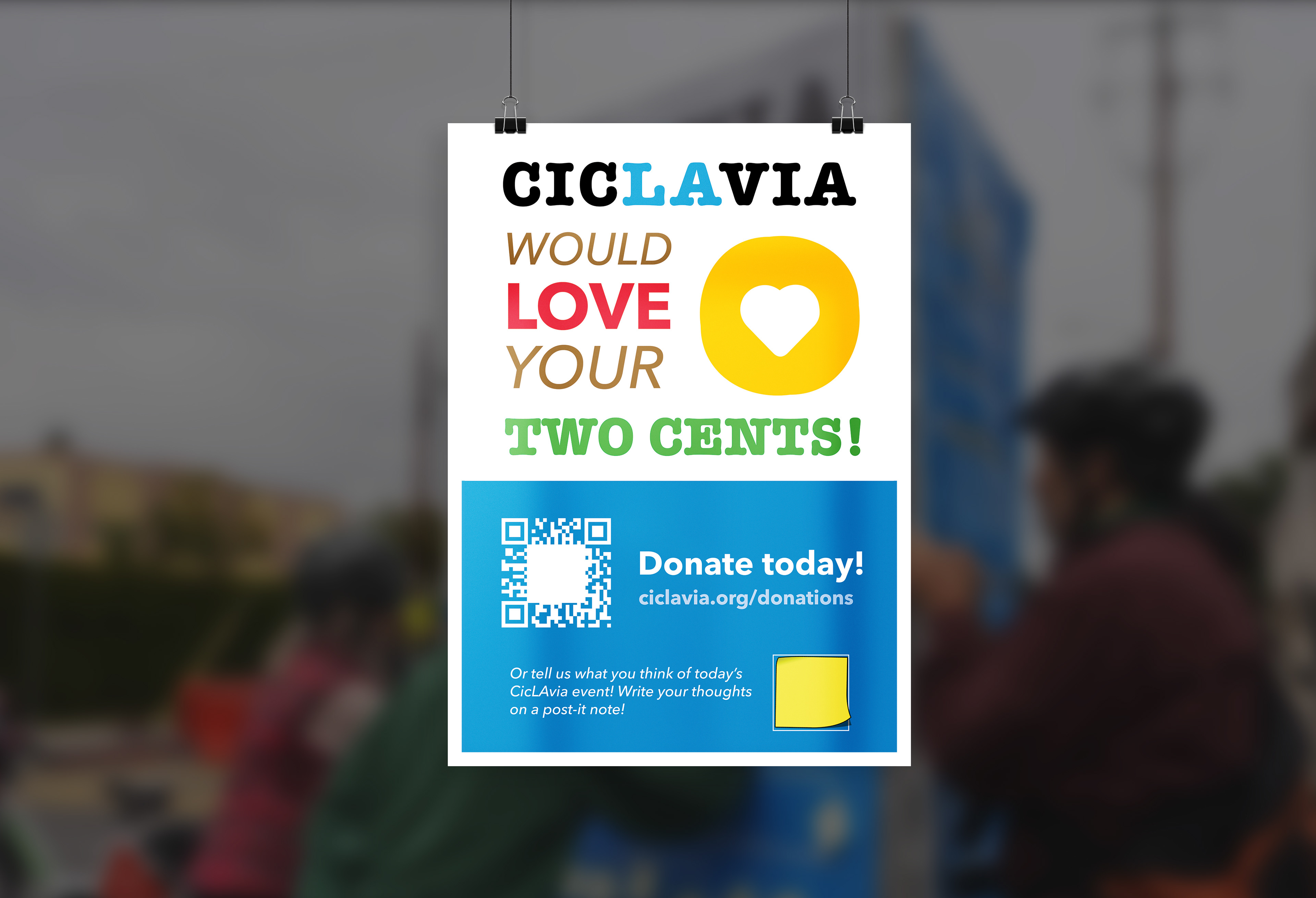
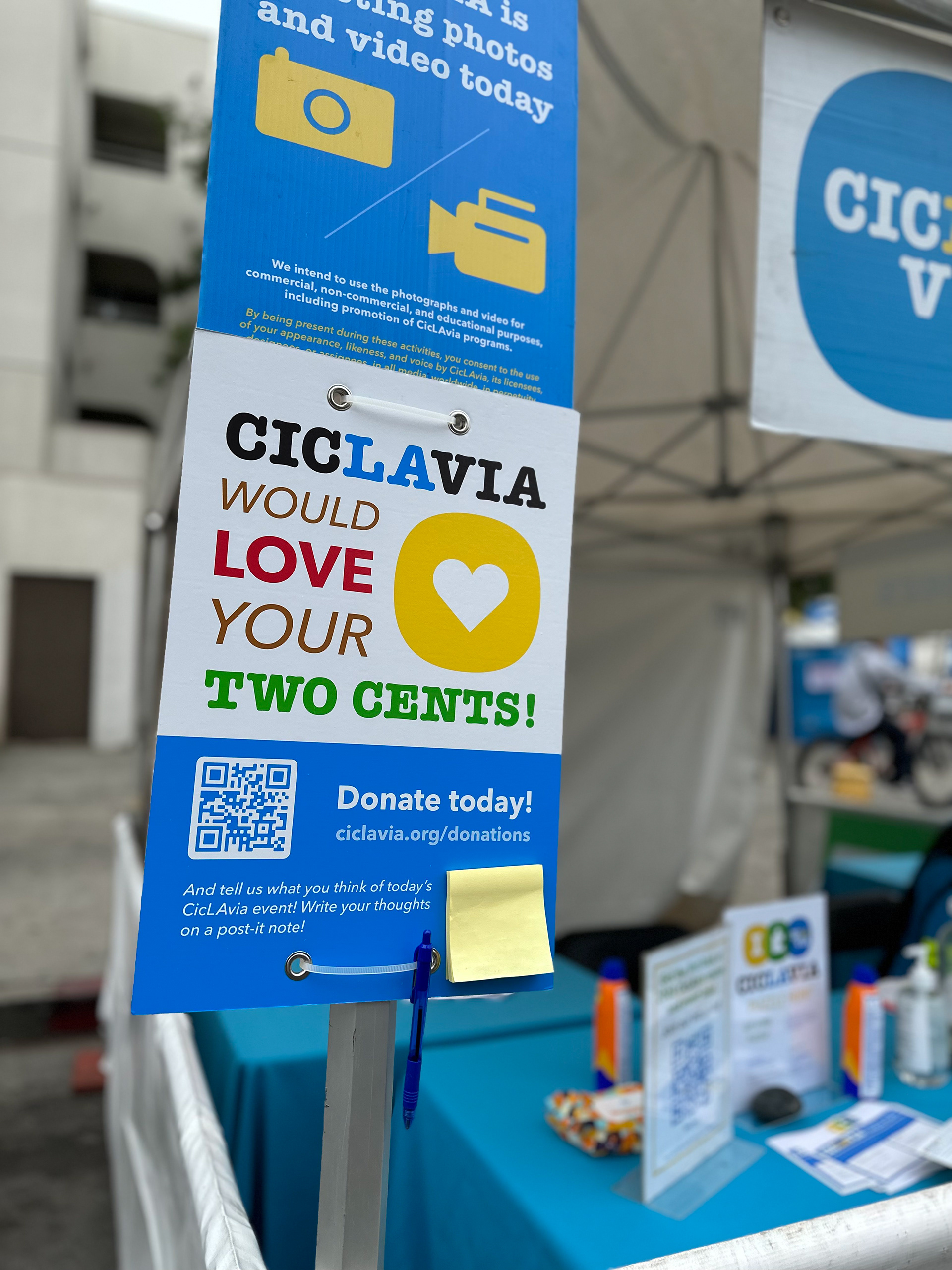
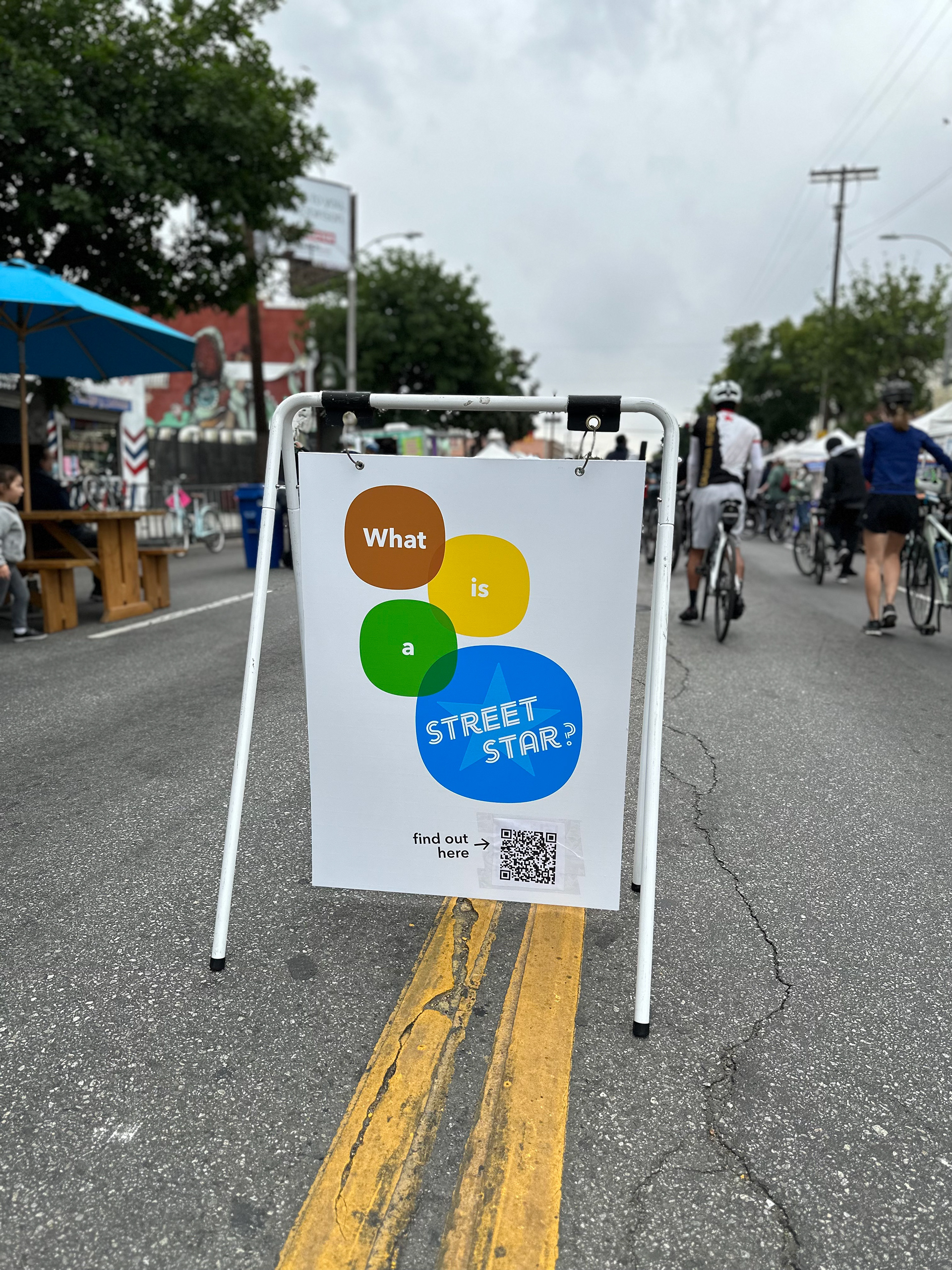
We designed a series of posters that focuses on the hybrid experience from print to digital — with a catchy participatory tagline that encourages user interaction and a QR code for extended storytelling.
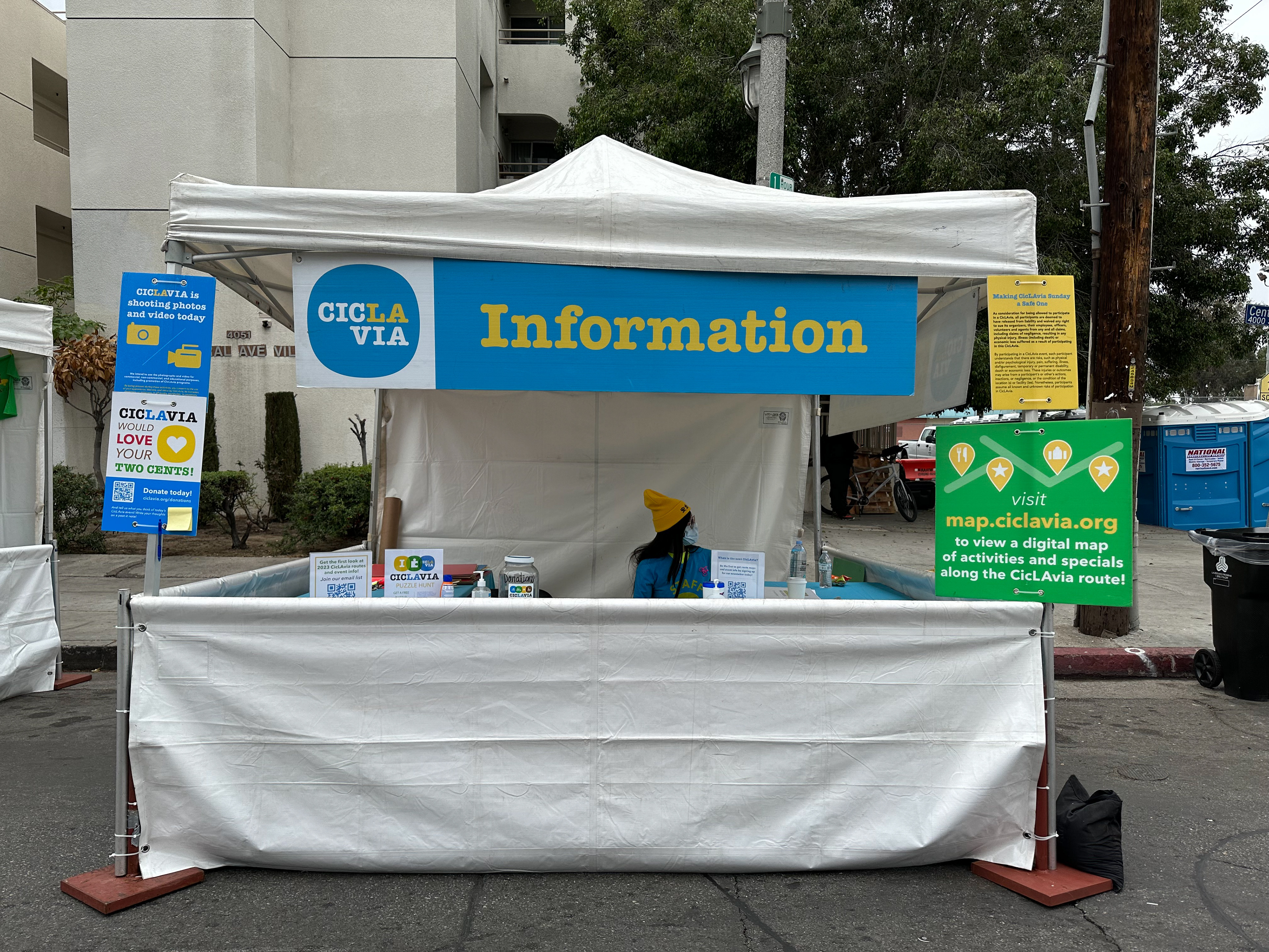
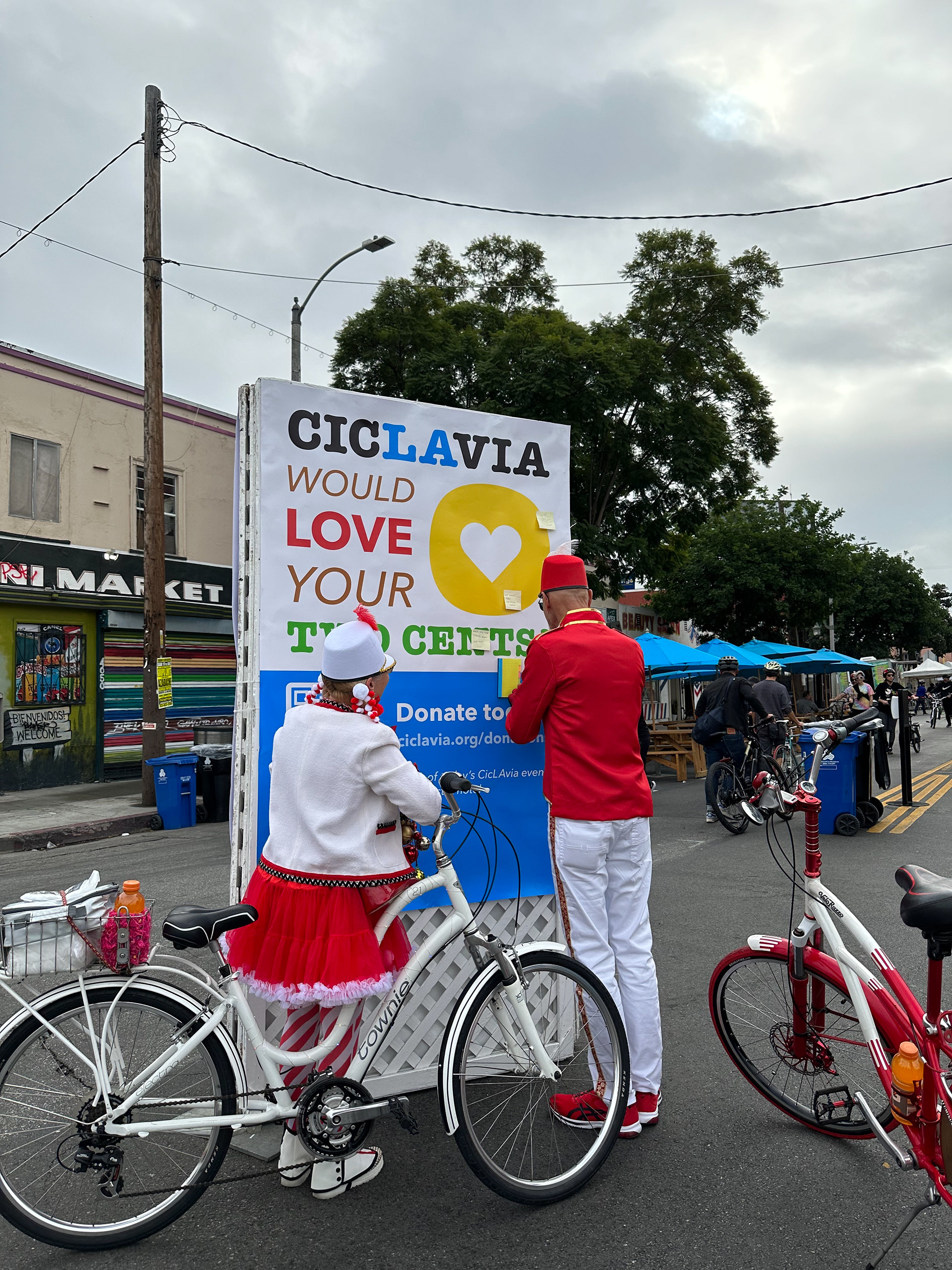
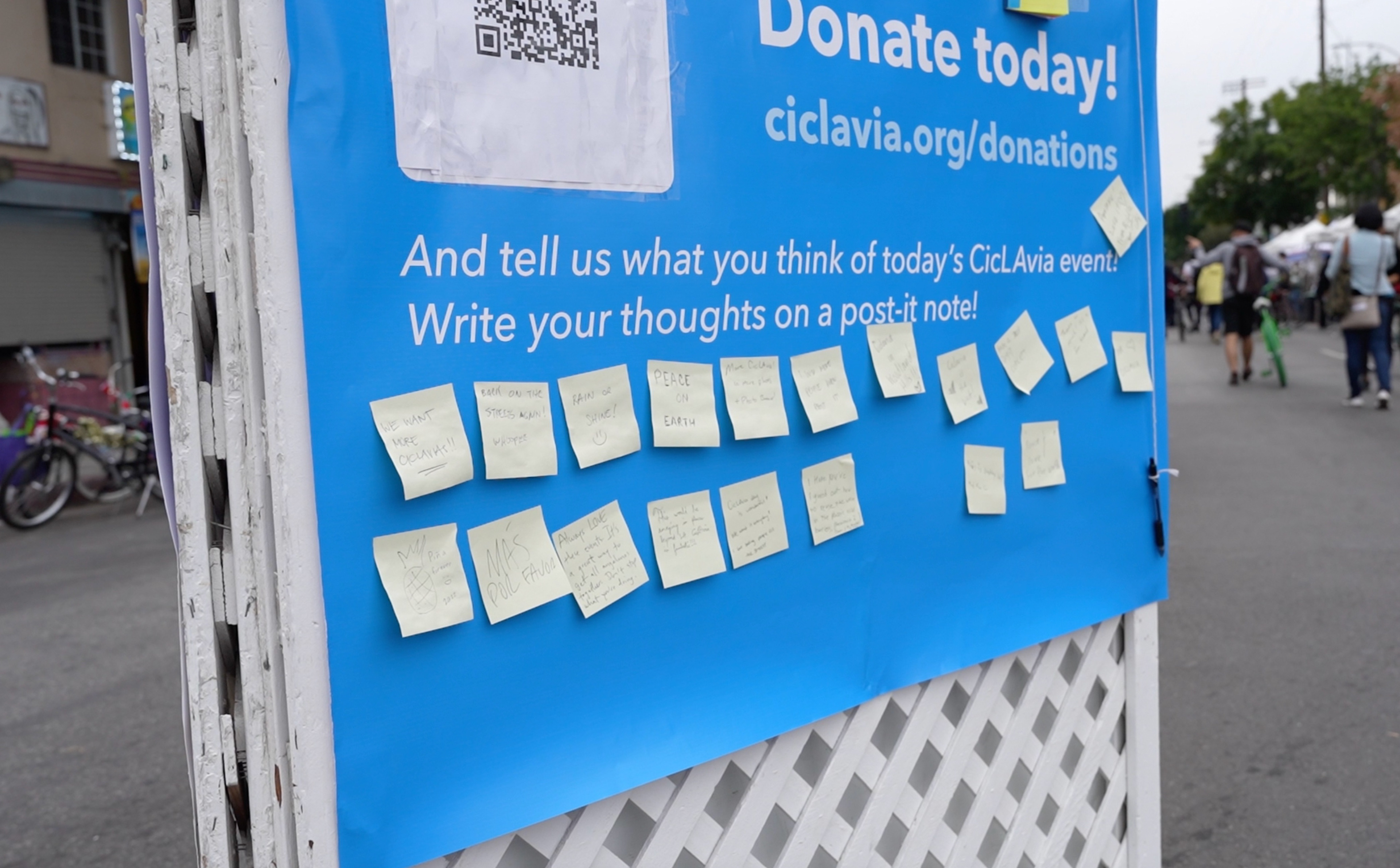
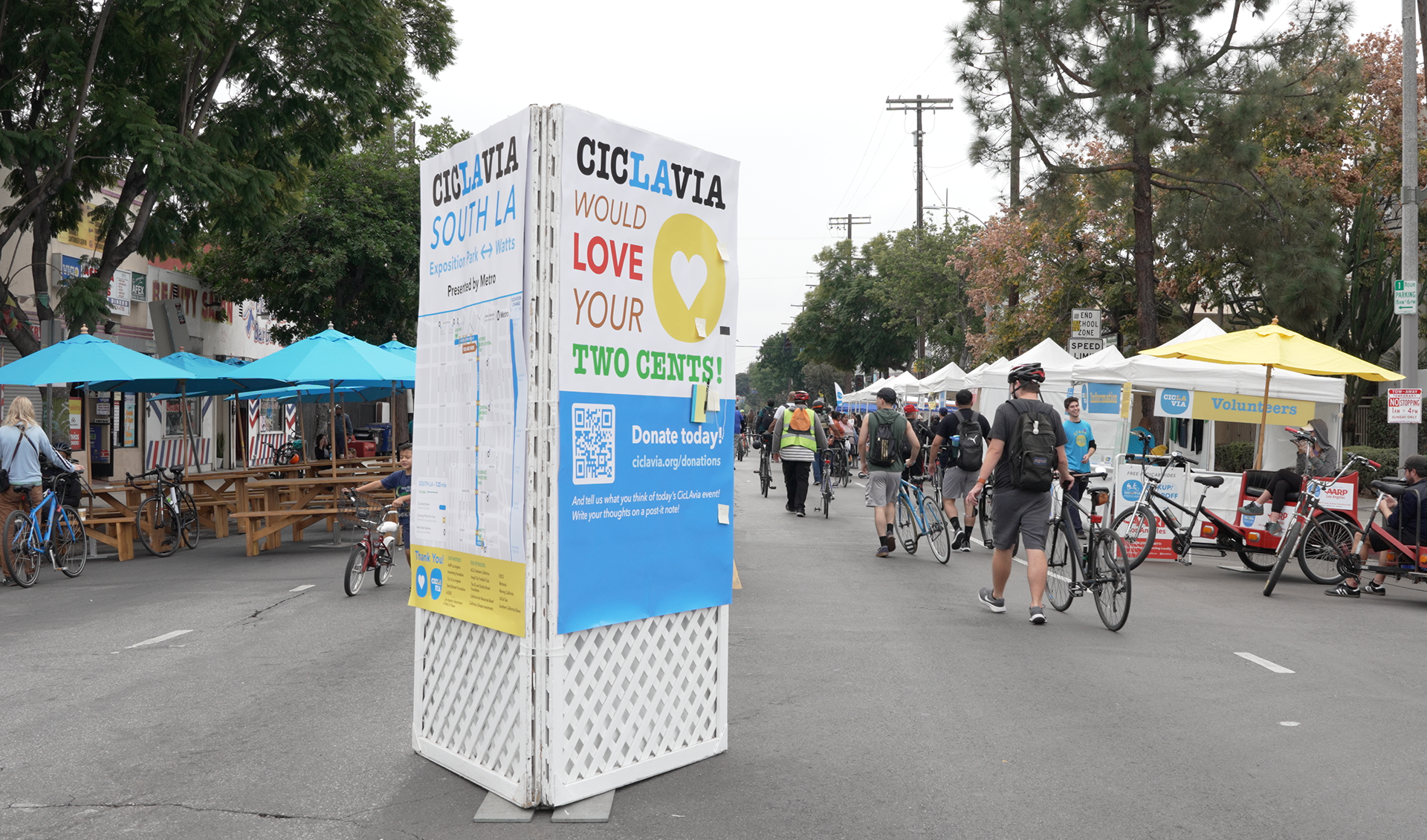
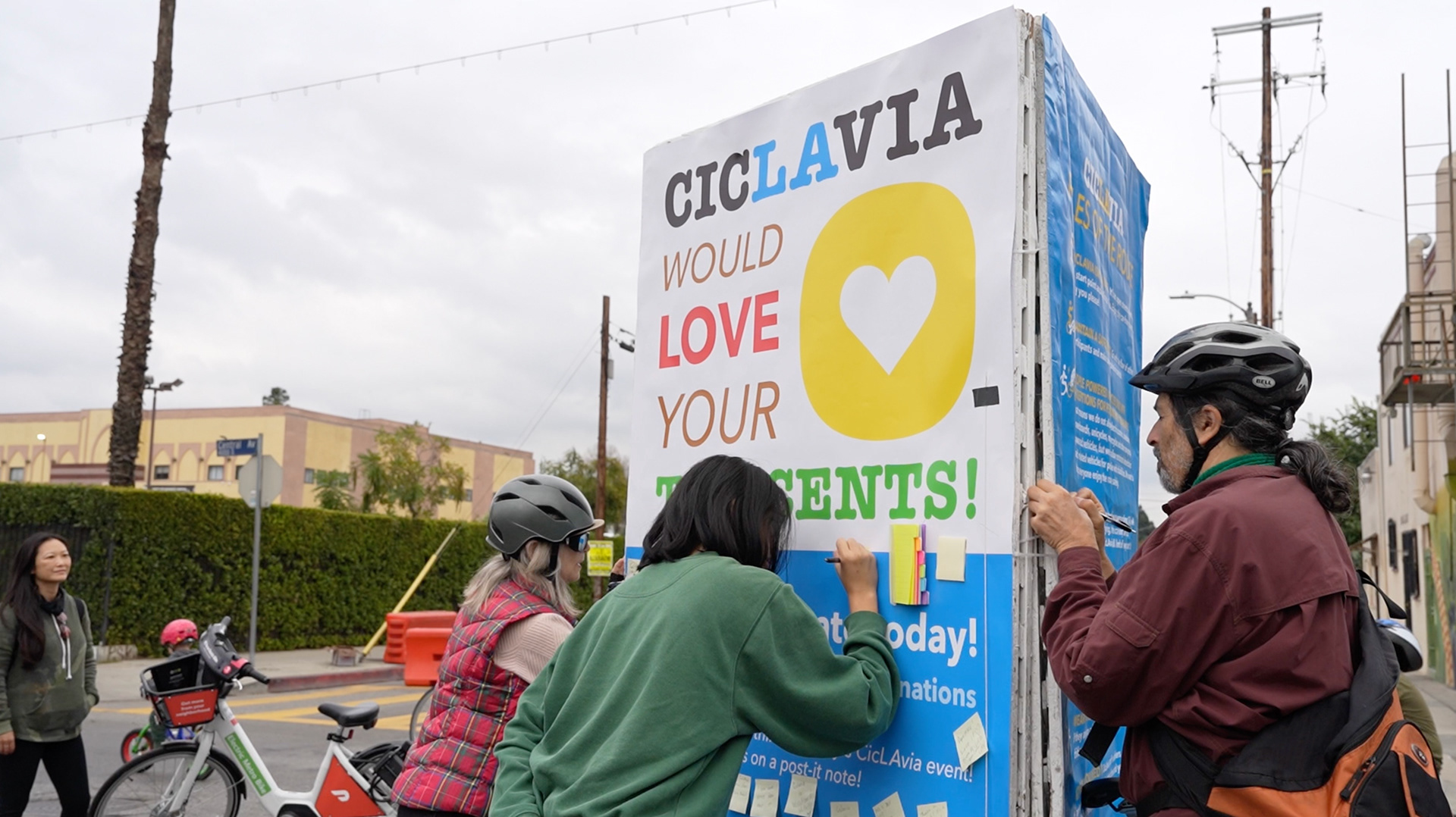
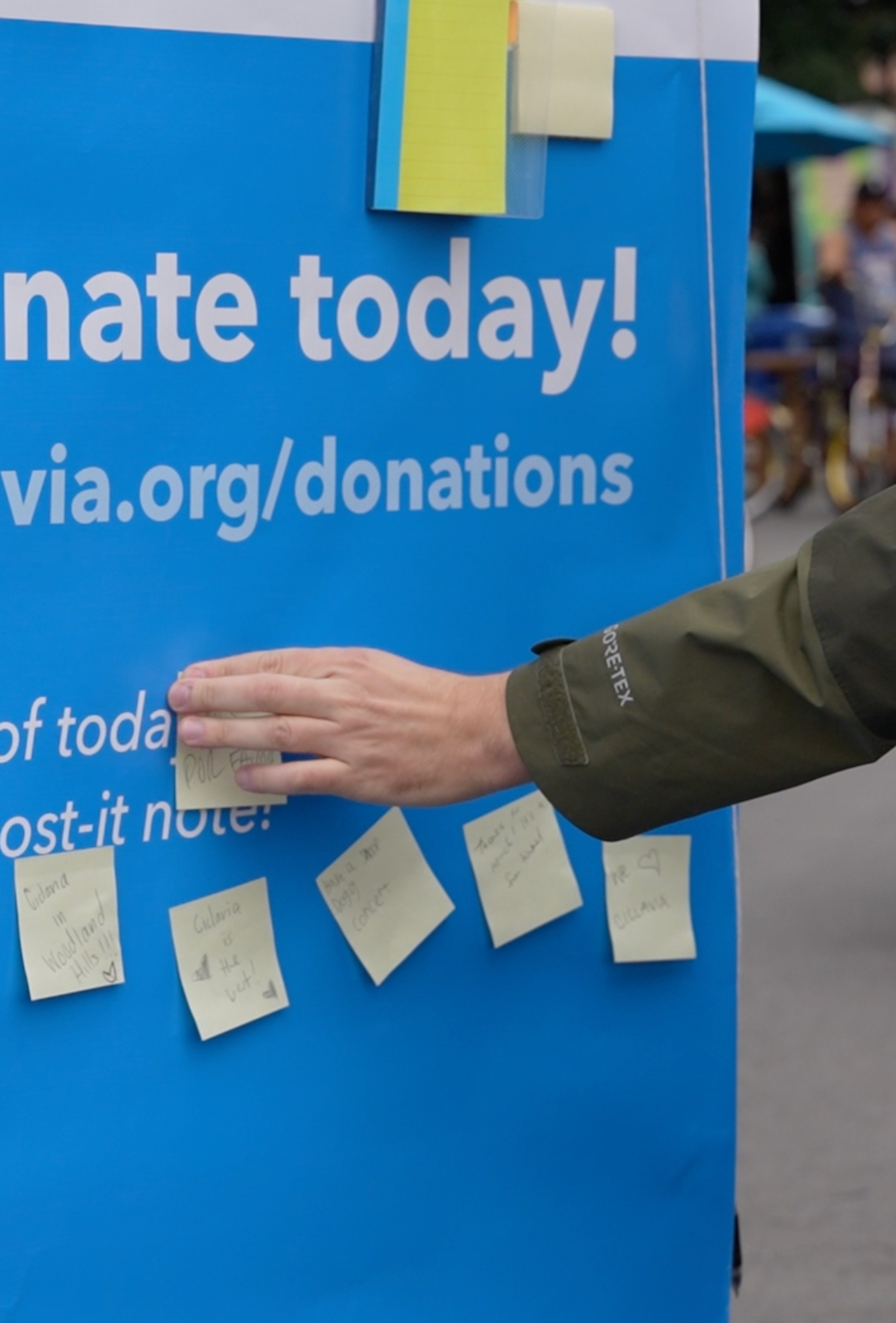
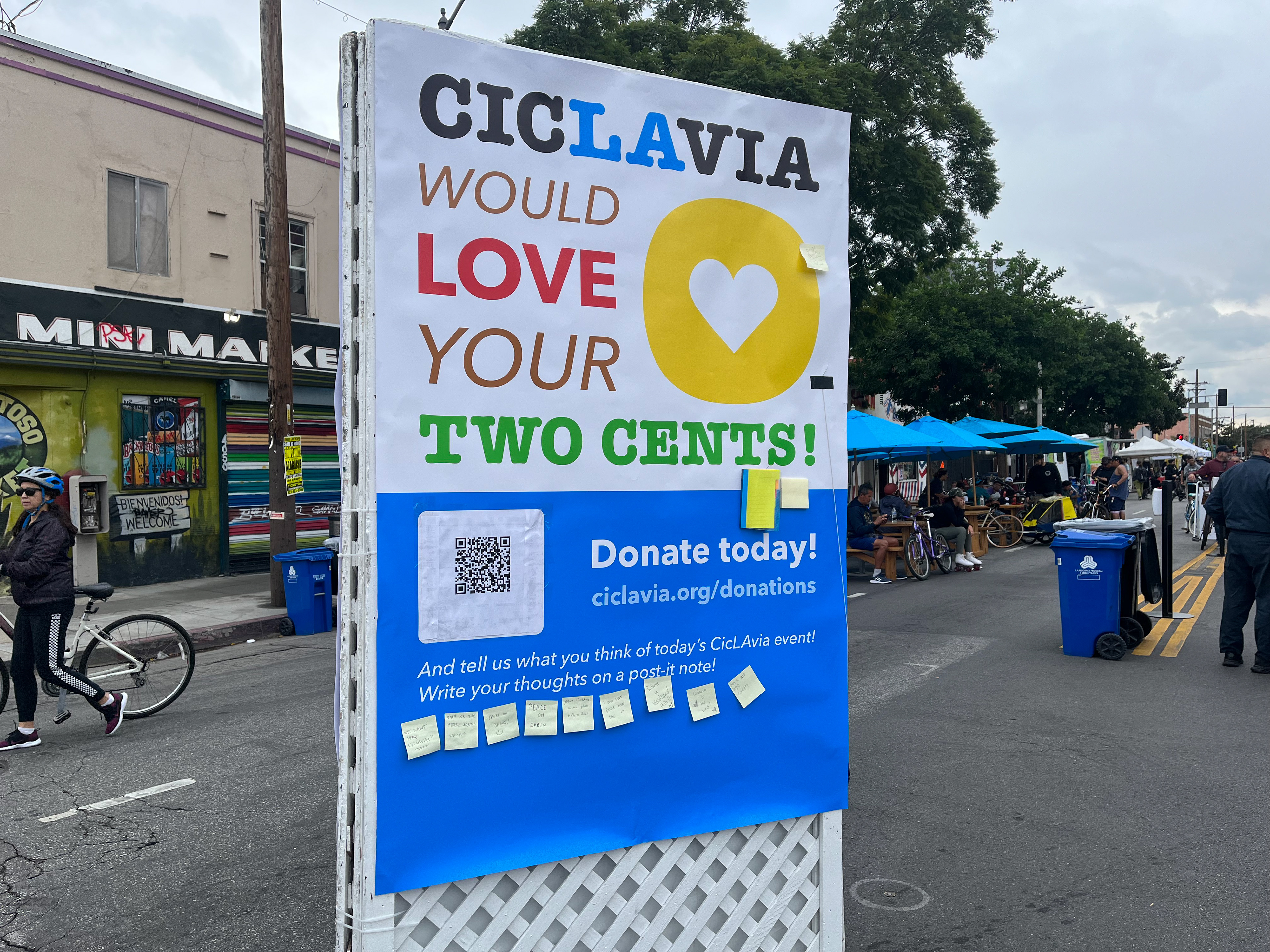
One of our posters that says "CicLAvia would love your TWO CENTS", a wordplay on asking for donation and feedback, has a call-to-action for donation and an added layer of engagement, in which we offered a physical artifact that allows participants to write their two cents on. We garnered mostly positive sentiments and some requests that could improve their experience at the event.
CicLAvia is a non-profit that catalyzes vibrant public spaces, active transportation, and good health through car-free streets. CicLAvia engages with people to transform our relationship with our communities and with each other. Inspired by Bogotá’s weekly ciclovía, CicLAvia temporarily closes streets to car traffic and opens them to Angelenos to use as a public park.
Problem
As a non-profit, raising money is always a struggle. Most participants often don't think about donating at the day of the event. From the lens of fundraising and partnerships, our team was tasked to find ways for CicLAvia to increase and generate support from donors and partners.
Insights
Compared to other open streets events/organizations in the United States, CicLAvia has a much stronger brand identity and social media presence. This is helpful in overcoming rejection hurdles based on reluctance of brand trust when asking for donations.
Event goers love CicLAvia — proven by the amount of people that look forward to the events and have a positive association with it. However, most people are unaware that the organization is a non-profit event staffed by only 9 people, that receives half of their funding from contracts and other half from their own fundraising efforts.
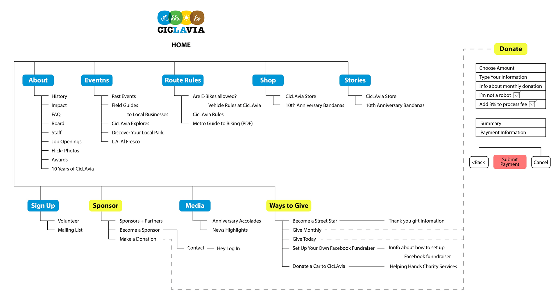
CicLAvia website information architecture
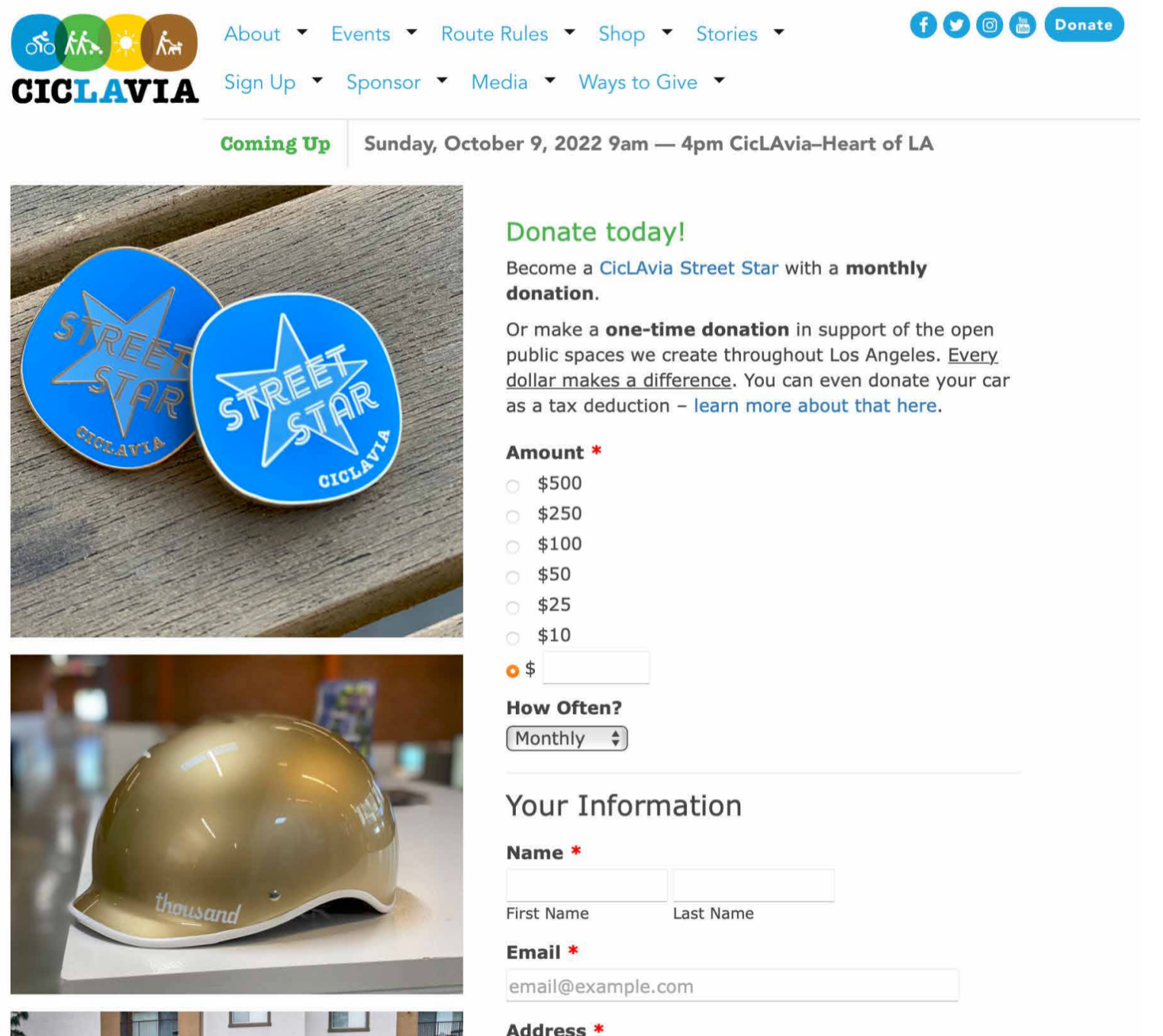
CicLAvia donation webpage
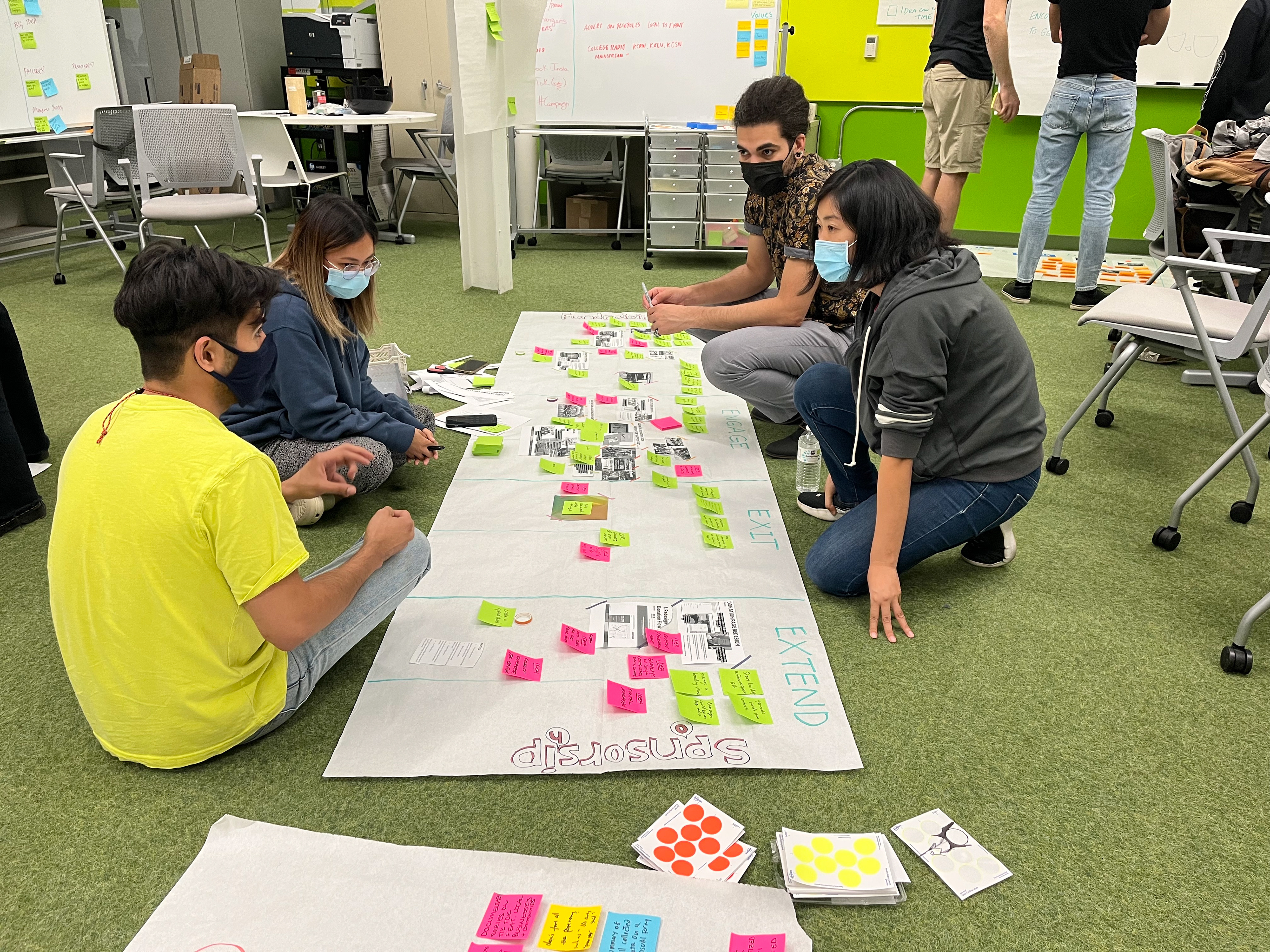
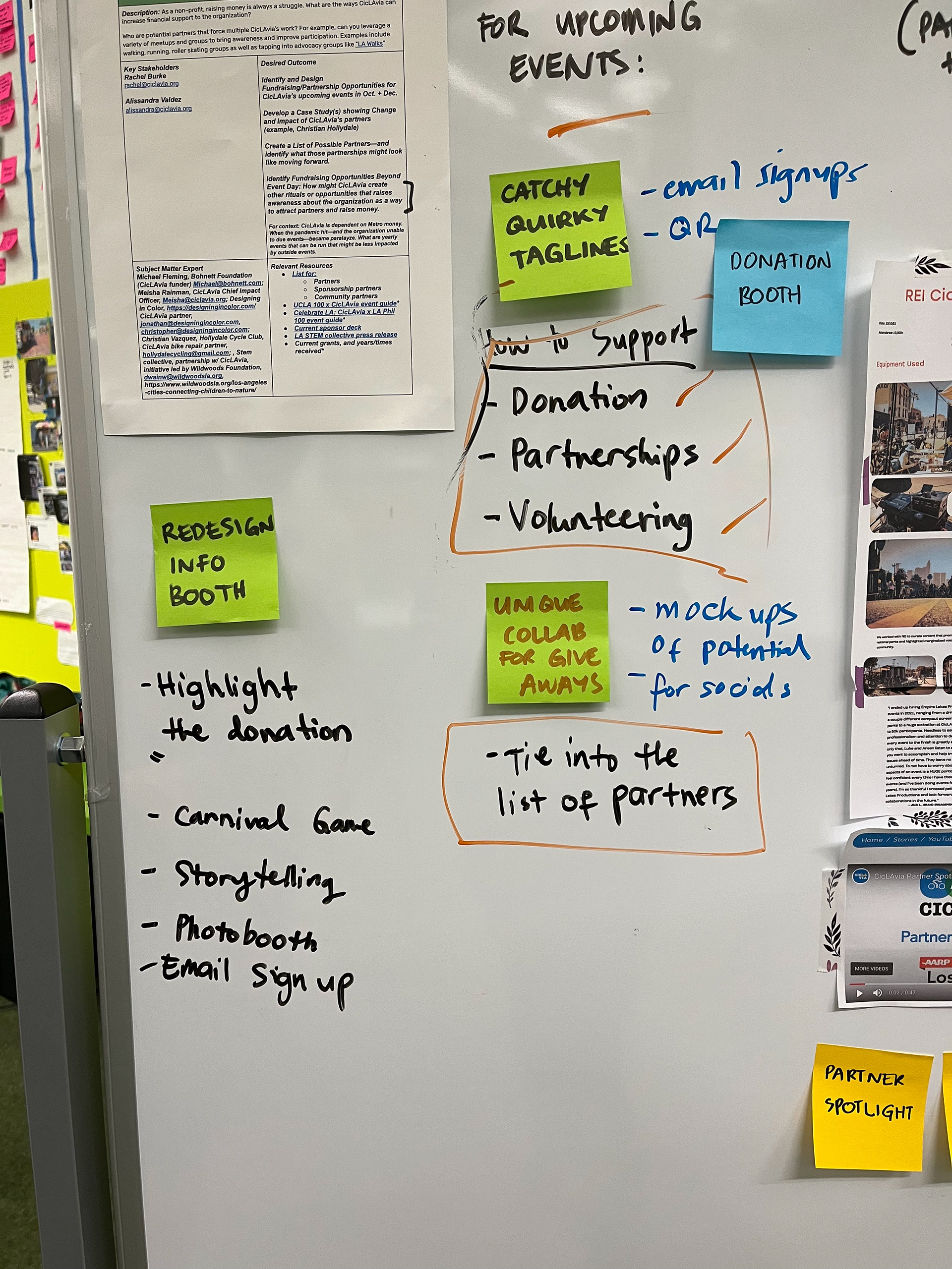
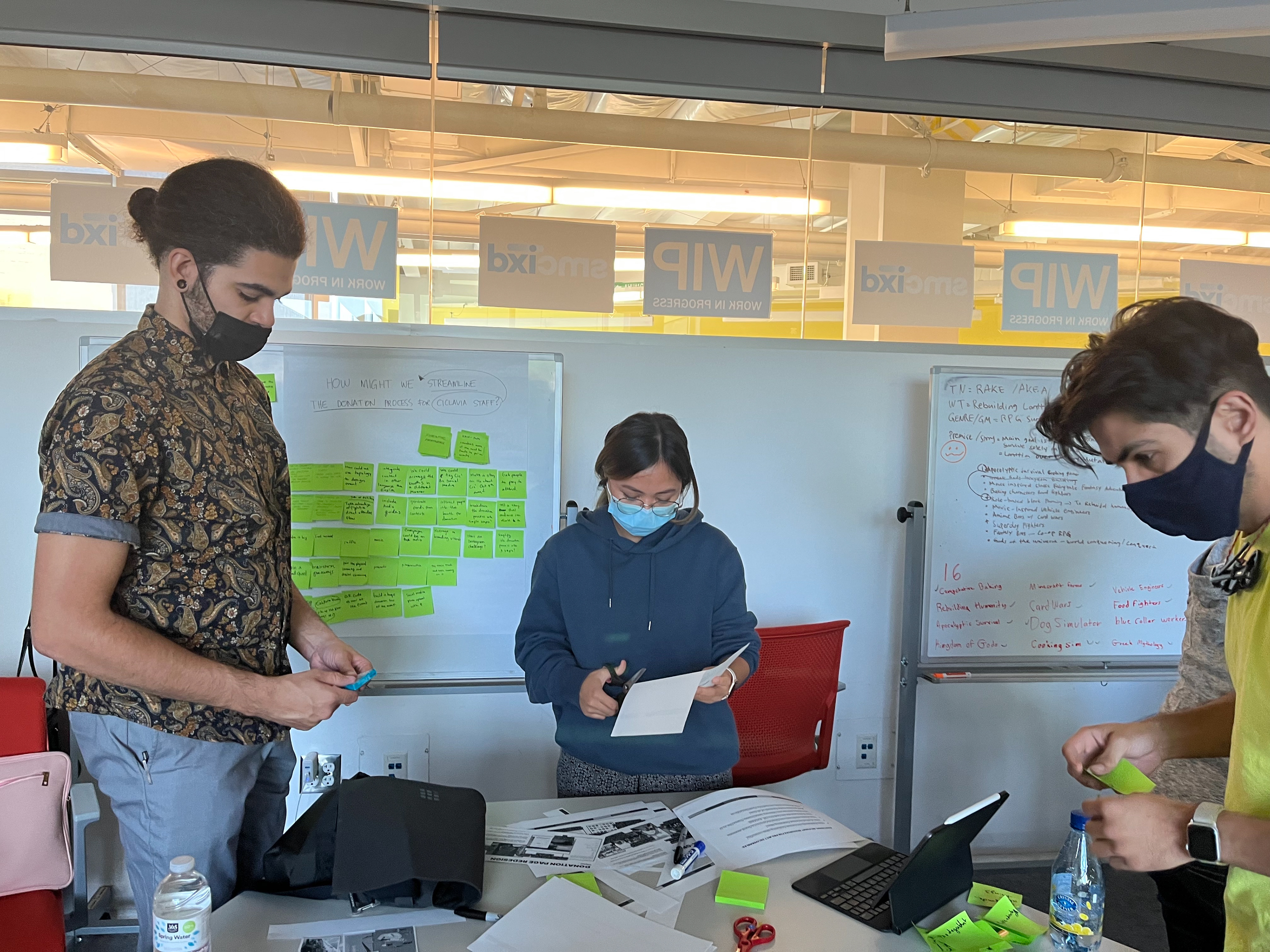
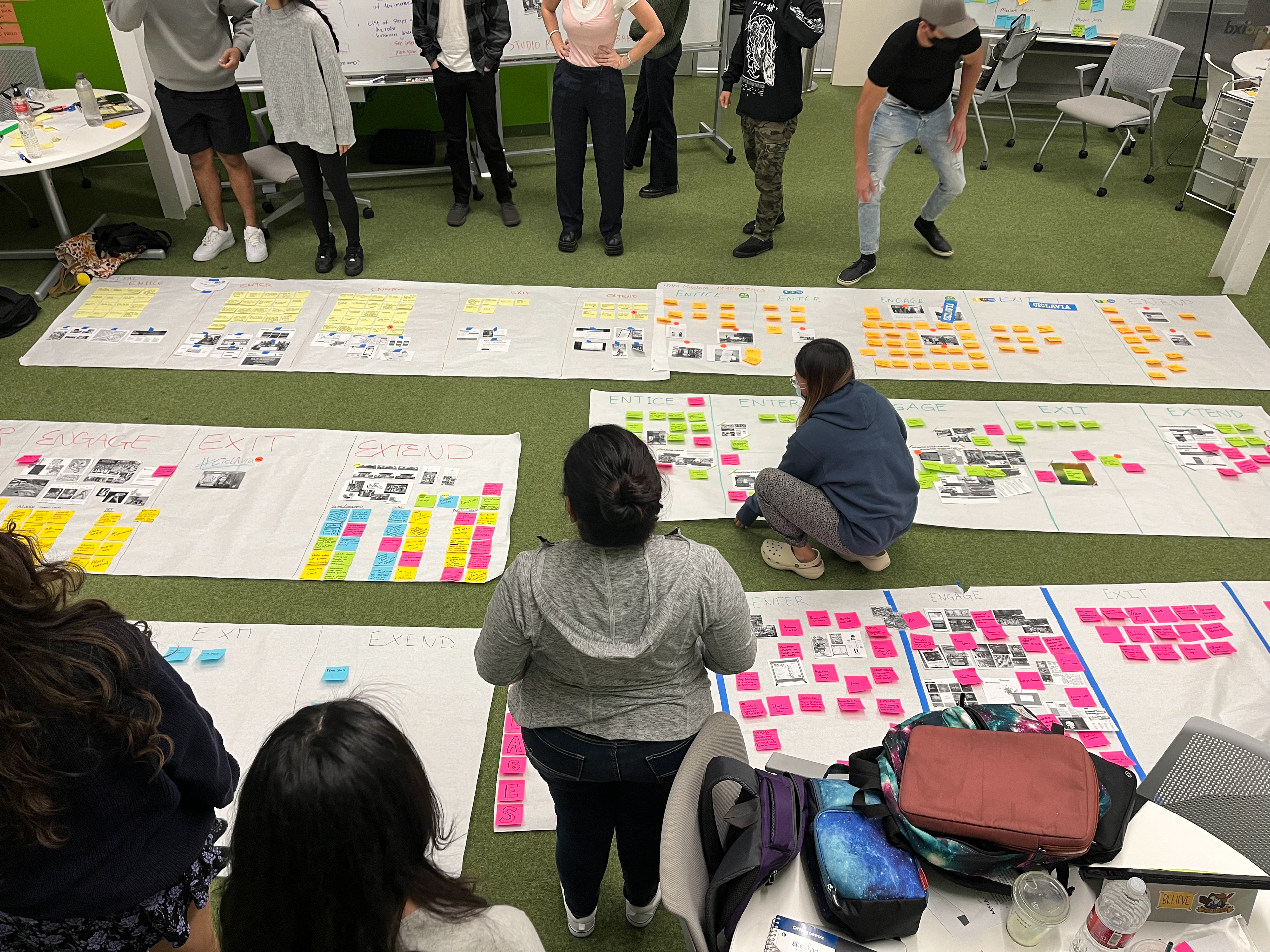
Research Methodology
- Competitive Analysis
- Netnography
- Heuristic Evaluations
- User Interviews and Surveys
- Observational Study
- Netnography
- Heuristic Evaluations
- User Interviews and Surveys
- Observational Study
Needs & Opportunities
We then evaluated their current donation system (on the website and at the event) and found opportunities to improve:
- a more seamless donation flow
- using video as a storytelling medium to connect with audience
- better way to advertise the Street Star program (monthly donation)
- discoverability of various ways users can support
- reorganizing the website contents
- streamlining the donation process at the event
Interviewing CicLAvia staff and several partners gave us useful insights of how CicLAvia operates and how we can approach our design challenge:
- one-time donations are "transactions" and monthly donations are "supporters"
- find partners that have similar values
- they get most of the Street Star sign-ups through email
- care to understand the conditions in different communities
- think of long-term relationships with donors
- the power of asking in fundraising
- people are unaware of the financial blueprint of CicLAvia
- engaging in different ways (aside from financial support)
- asking for donations at the day of the event is too labor intensive for the little amount of money
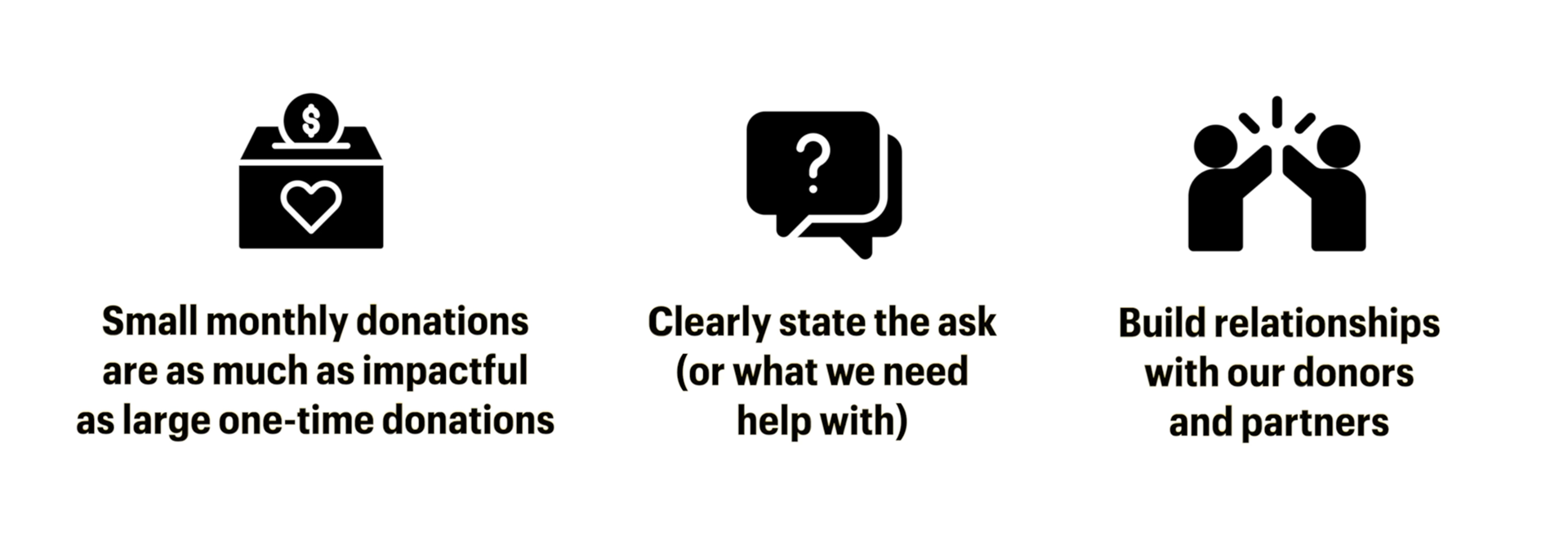
Survey Synthesis: October 9th Event
We surveyed 44 participants and found that while majority of them attend CicLAvia events regularly, more than 80% did not know about the Street Star program. Many of them were also interested in showing support by donating, but when asked about the reason why they have not donated, their answers vary between the patterns of financial difficulty and lack of awareness about the donation opportunities.
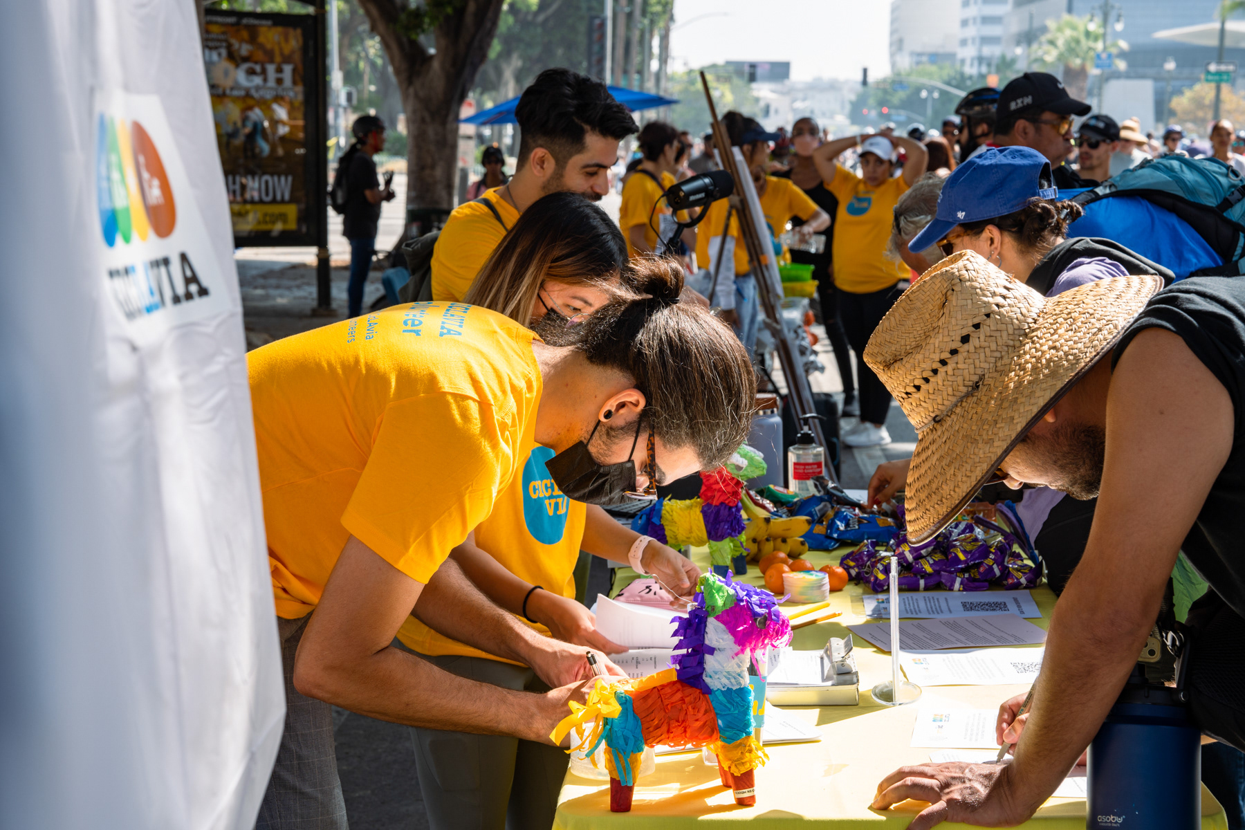
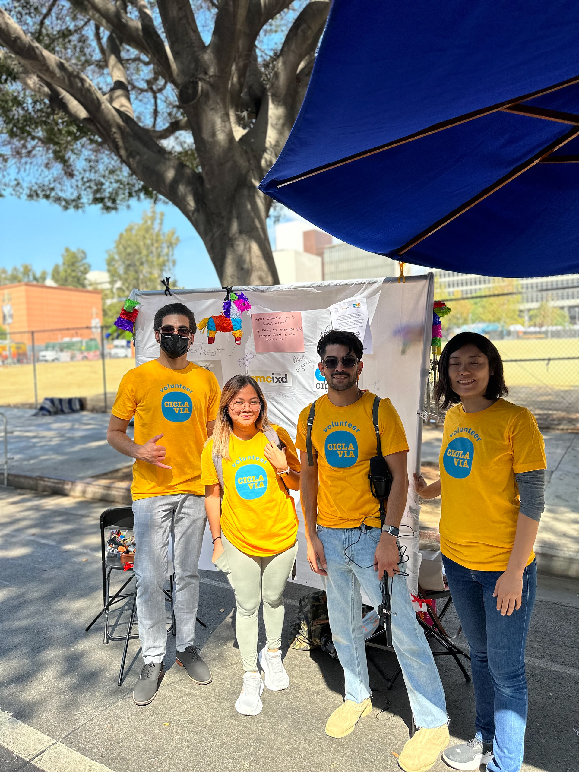
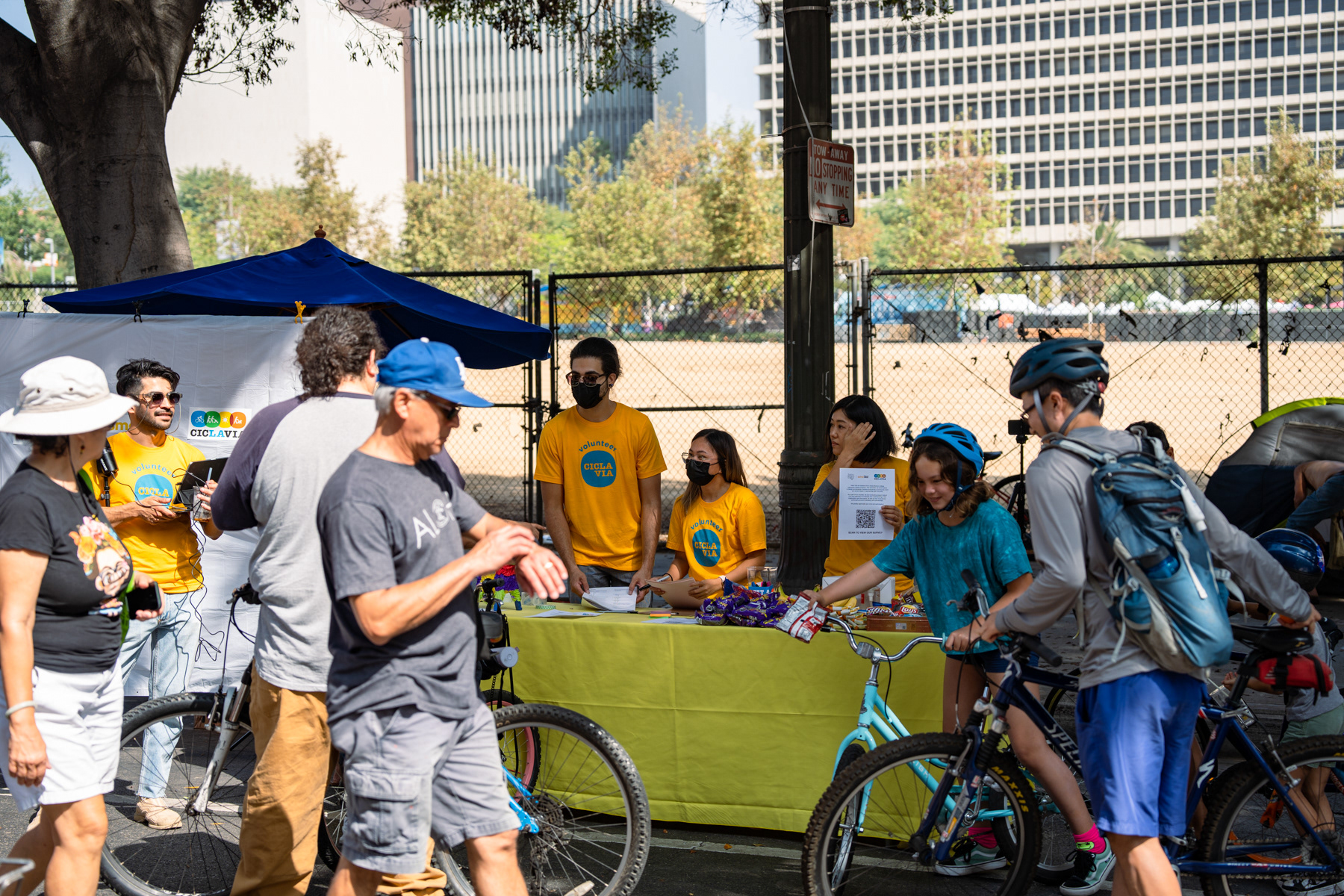
Field Testing: December 4th Event
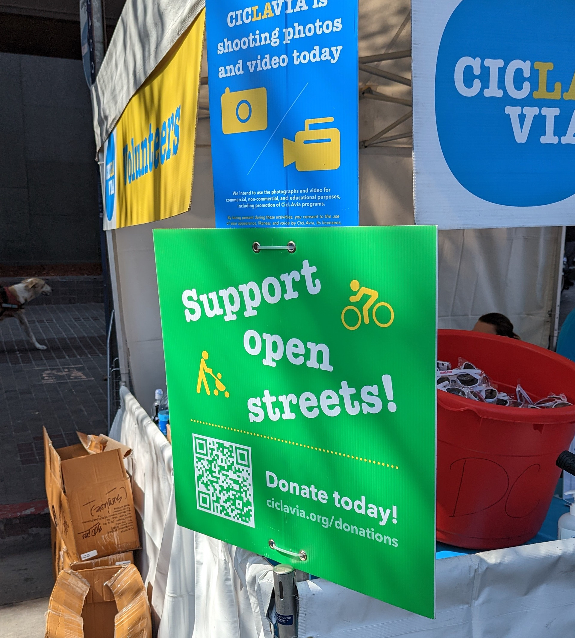
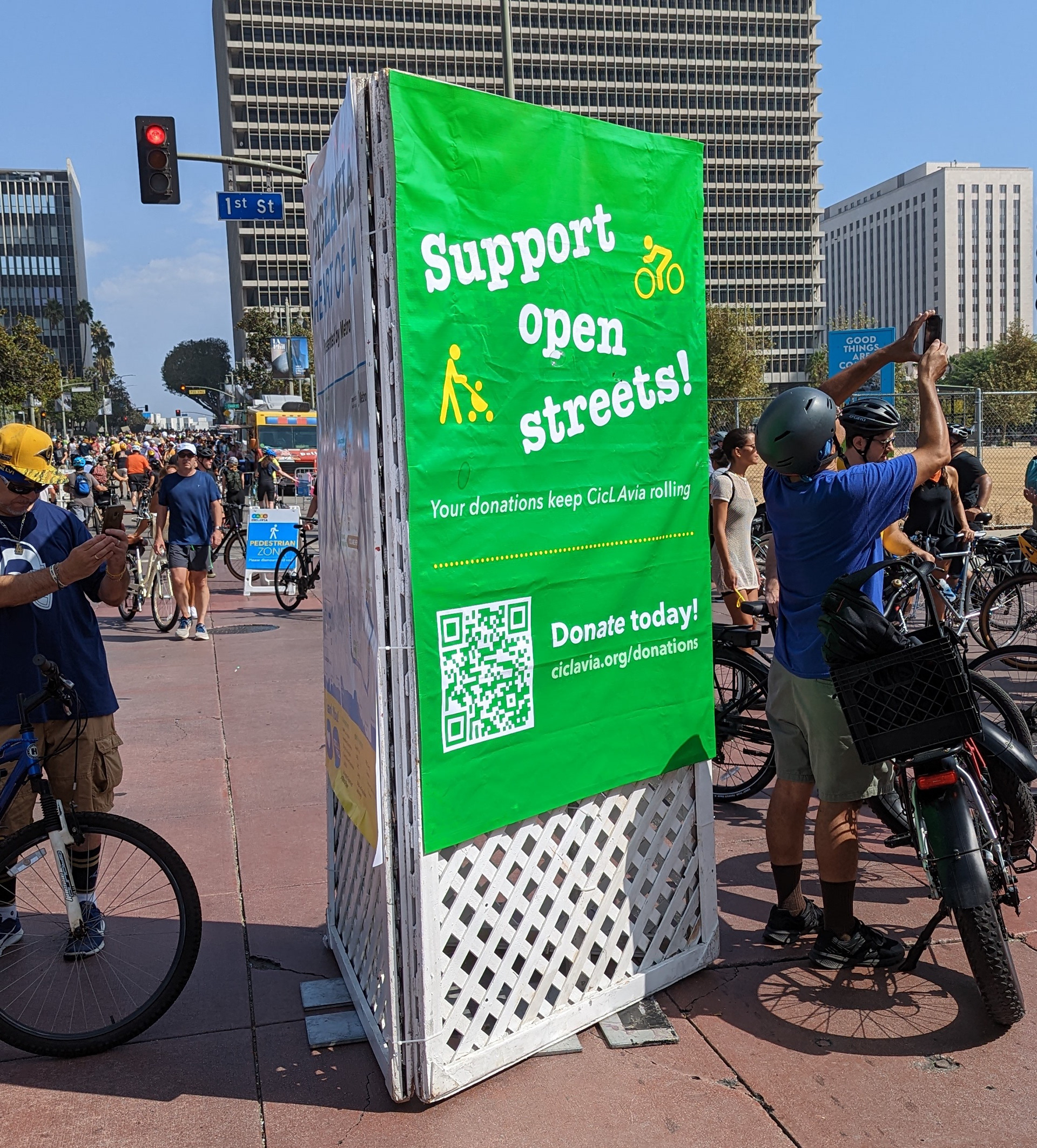
Our posters were spread out across different hubs and we have found that scale and placement matters. We tested the same design in various sizes and locations and the one that gathered the most attention was the largest one placed next to the route map.
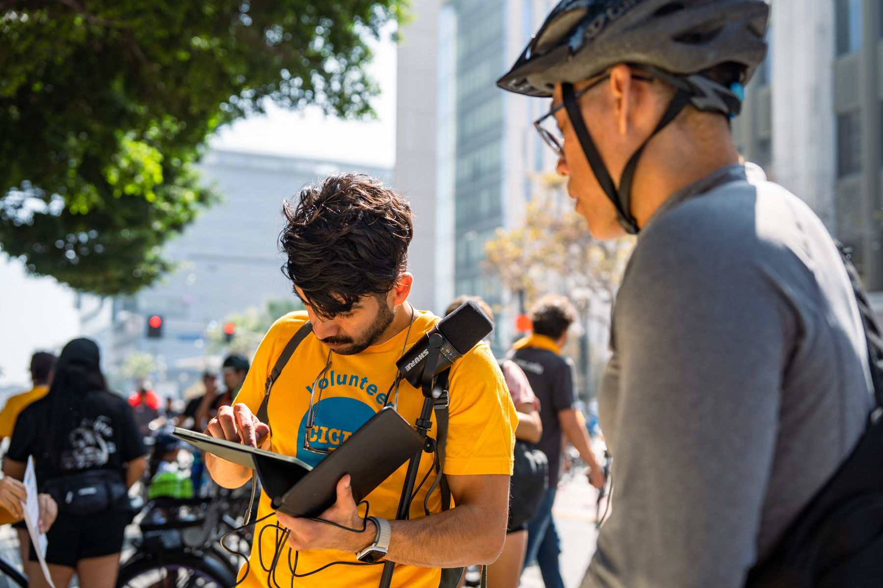
We also have found that without encouragement and guidance to engage with the posters, most event goers were reluctant. However, they were willing and open to do so once encouraged. Having someone to facilitate the engagement makes a lot of difference.
Overall, we gained valuable insights about how participants interact with static marketing materials at large events. We noticed that after participants write their "two cents", they either take a photo of their post-it note or take a selfie in front of the poster.
Future Considerations
VIVID COLOR AND UNIQUE ELEMENTS
To draw people's attention and stand out from other posters at the event
To draw people's attention and stand out from other posters at the event
PARTNERING WITH FOOD TRUCK VENDORS
A key location where many people gather and often have their phones out
A key location where many people gather and often have their phones out
VOLUNTEER FACILITATION
Staff and volunteer could stand near the large posters to answer questions and encourage engagement, and also to build trust and connection with donors
Staff and volunteer could stand near the large posters to answer questions and encourage engagement, and also to build trust and connection with donors
AUGMENTED REALITY
Implementing AR design elements to enhance the experience
Implementing AR design elements to enhance the experience
